Bridging global prestige with Korean identity through symbolic design
THE CJ CUP @ NINE BRIDGES – Brand Identity for South Korea’s First PGA TOUR Event
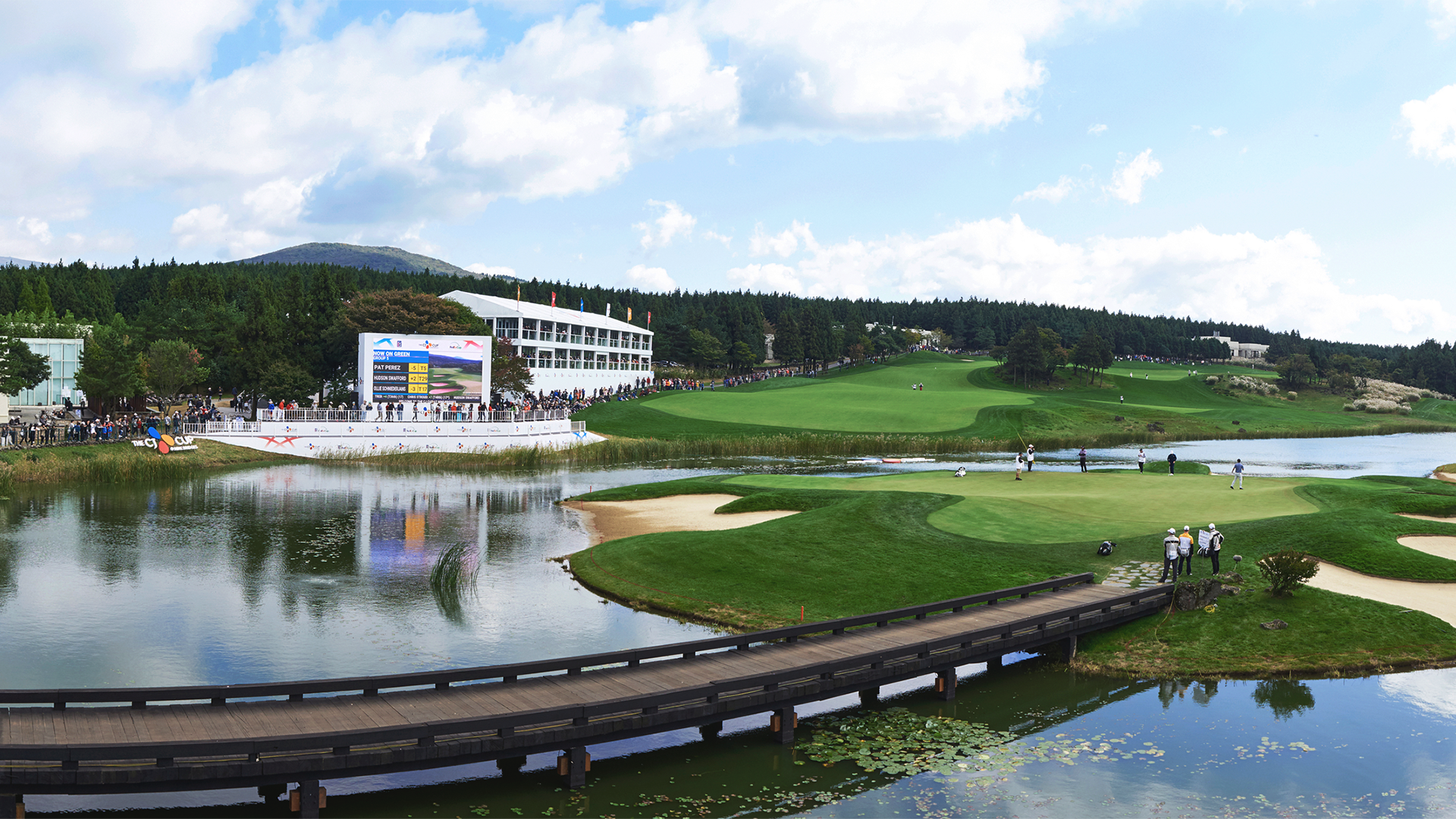
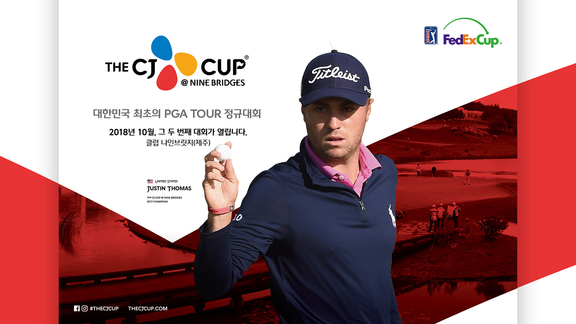
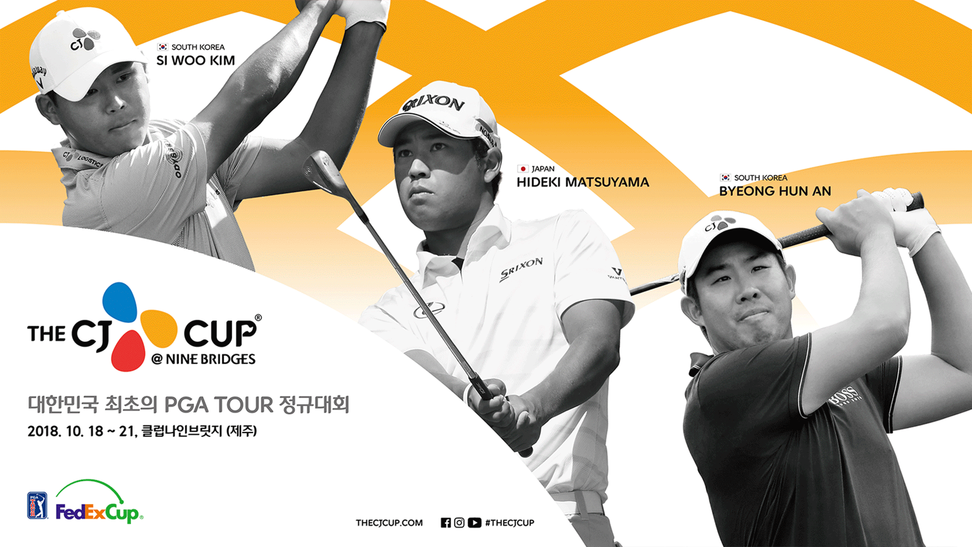
THE CJ CUP @ NINE BRIDGES is South Korea’s first official PGA TOUR event, launched in 2017 through a partnership between CJ Group, the PGA TOUR, and Nine Bridges Golf Club. The project required a comprehensive visual identity system that would embody Korean cultural values while meeting the international standards of a global golf tournament. I participated as a junior designer and contributed to the creation of the logotype, symbolic visual motif, and a full application system that spanned print, digital, signage, and spatial branding. This identity became the foundation of the tournament's ongoing legacy.
Role
- Contributed as a junior designer to CJ Golf’s first brand identity project
- Proposed visual directions and refined key design mockups
- Helped build design guidelines for use across print, digital, and spatial media
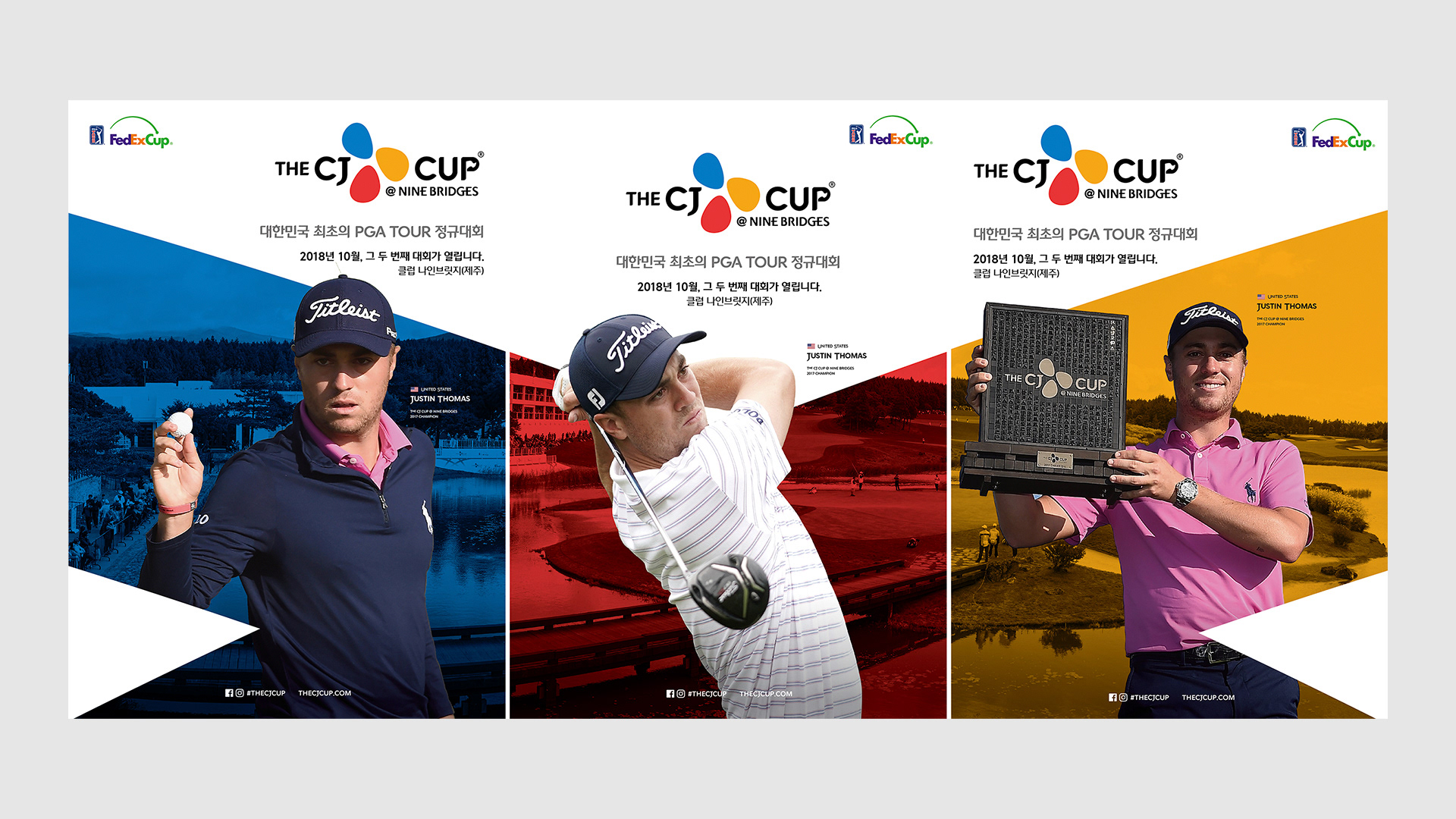
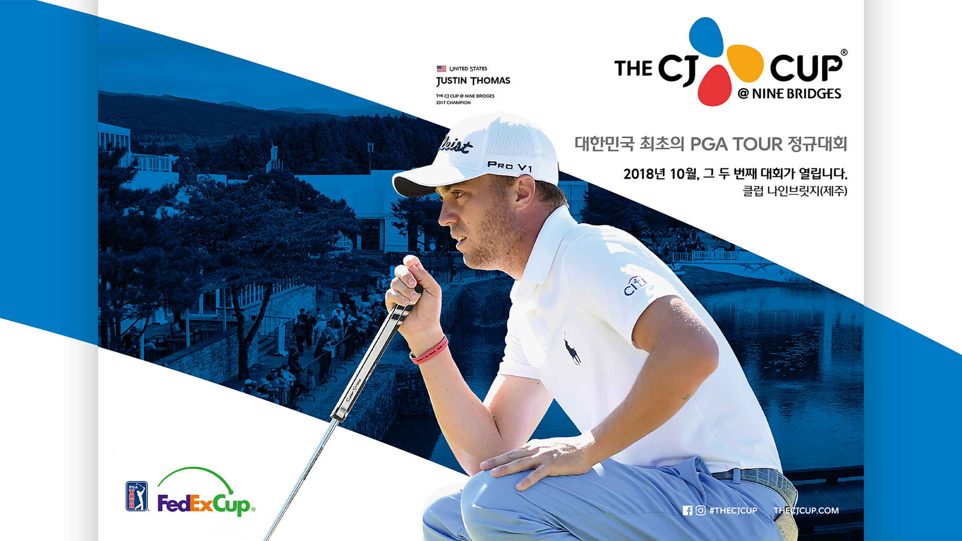
- Rolled out the identity on-site through brochures, signage, scorecards, and digital assets
- Supported the trophy design for THE CJ CUP @ NINE BRIDGES, integrating Korean cultural elements
- Collaborated with internal teams and the creative director to ensure brand consistency
- Proposed visual directions and refined key design mockups
- Helped build design guidelines for use across print, digital, and spatial media
- Rolled out the identity on-site through brochures, signage, scorecards, and digital assets
- Supported the trophy design for THE CJ CUP @ NINE BRIDGES, integrating Korean cultural elements
- Collaborated with internal teams and the creative director to ensure brand consistency
Challenge
- Create a brand identity that reflects Korean cultural values and CJ Group’s global vision
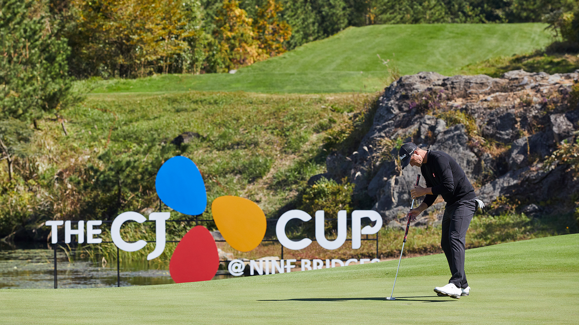
- Ensure consistent visual branding across diverse mediums: physical space, print, digital
- Balance symbolism, elegance, and clarity for both Korean and international audiences
- Develop a trophy design concept that holds narrative and emotional value
- Ensure consistent visual branding across diverse mediums: physical space, print, digital
- Balance symbolism, elegance, and clarity for both Korean and international audiences
- Develop a trophy design concept that holds narrative and emotional value
Creative Approach
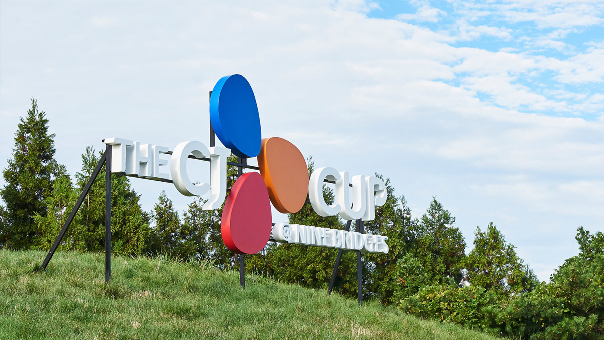
- Derived the visual motif from CJ’s Blossom Symbol and Nine Bridges' architecture
- Designed intersecting, rising lines to symbolize ambition, unity, and global connection
- Applied this motif across identity applications for structural and narrative consistency
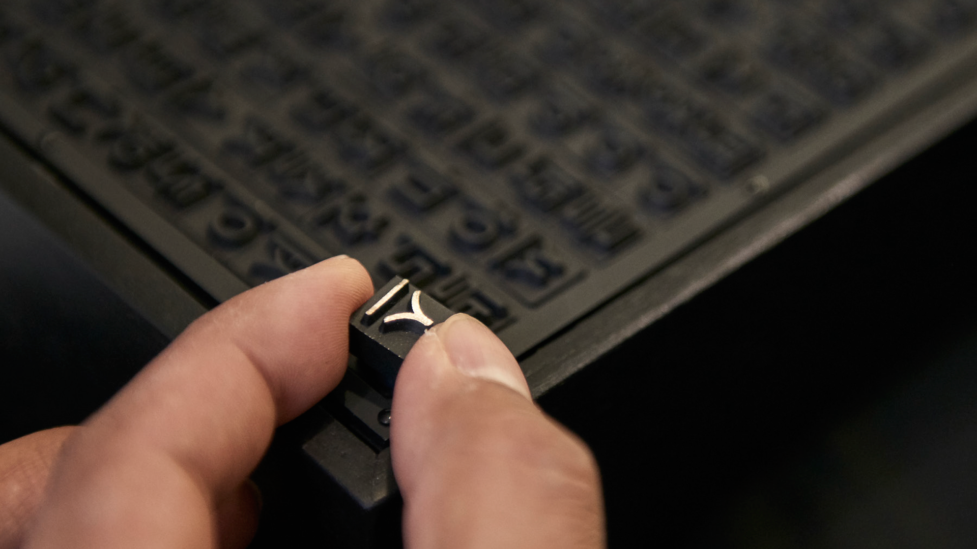
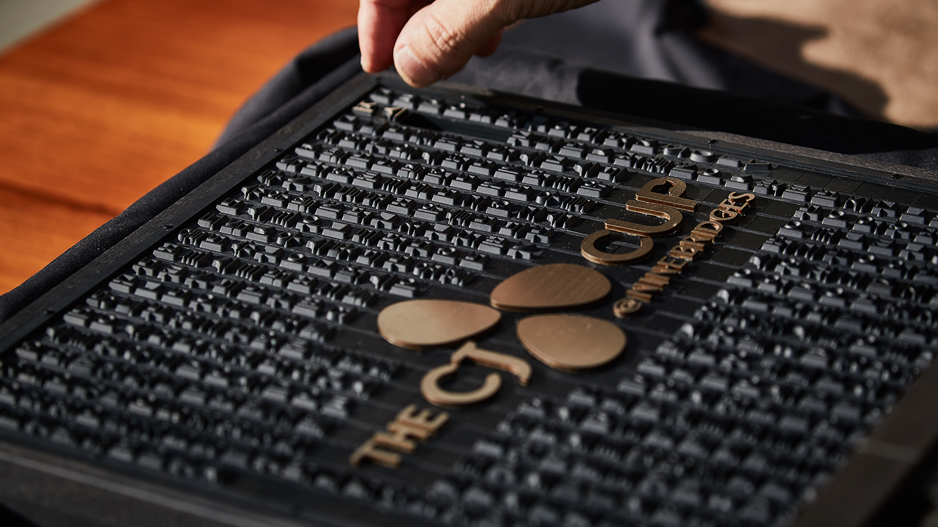
- Trophy design referenced traditional Korean culture, including Hangul and Jikji (the world's first metal-type book)
- Engraved participants' names in Hangul, with the champion’s name highlighted in gold
- Trophy base represented the 18th hole's iconic bridge as a metaphor for personal victory
- Designed intersecting, rising lines to symbolize ambition, unity, and global connection
- Applied this motif across identity applications for structural and narrative consistency
- Trophy design referenced traditional Korean culture, including Hangul and Jikji (the world's first metal-type book)
- Engraved participants' names in Hangul, with the champion’s name highlighted in gold
- Trophy base represented the 18th hole's iconic bridge as a metaphor for personal victory

Logo Concept


TROPHY DESIGN
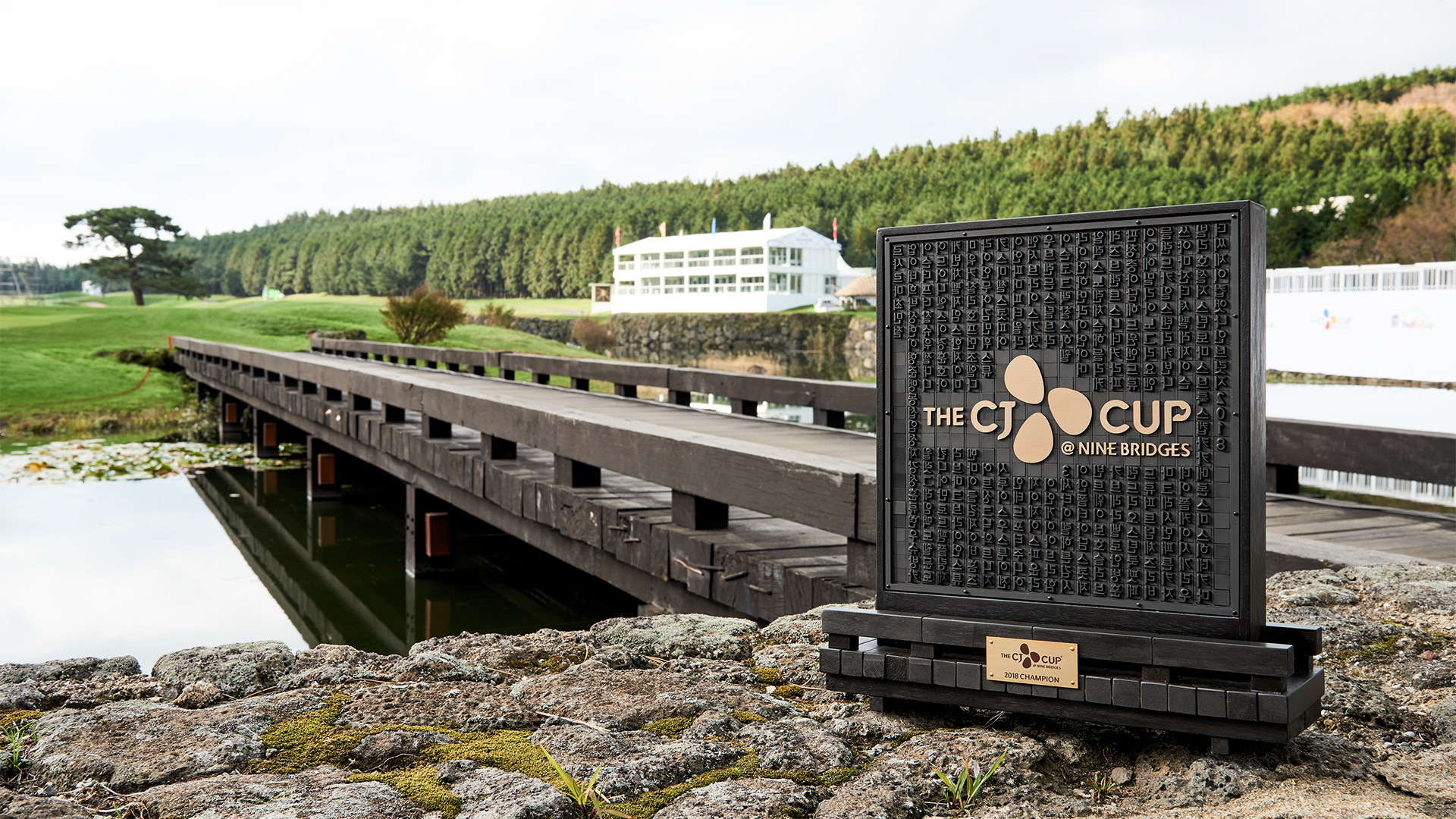
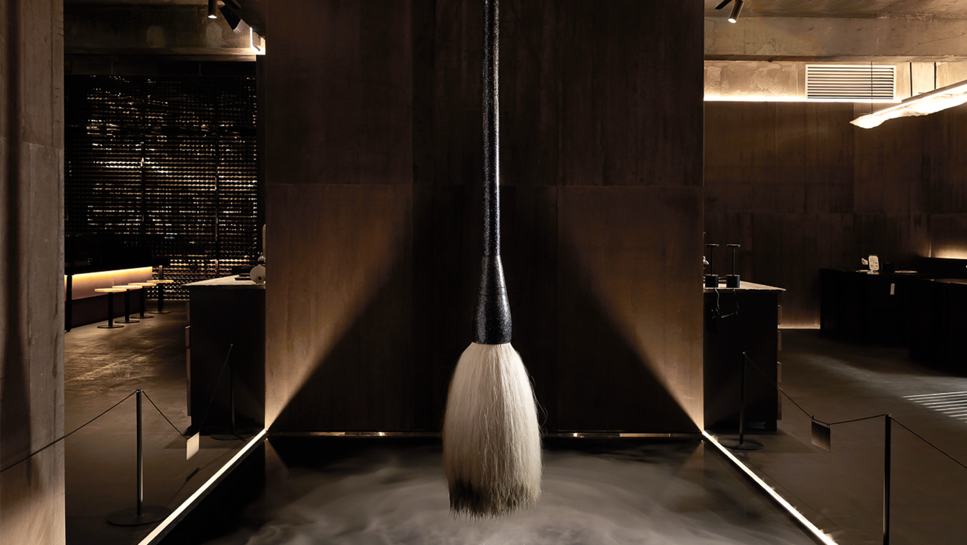
The championship trophy for THE CJ CUP draws inspiration from Korea’s rich cultural heritage, incorporating Hangeul, the Korean alphabet, and Jikji, the world's first metal-printed book. The names of all participating players are engraved in Hangeul type, with the winner’s name highlighted in gold during the final round.
The wooden base symbolizes the actual bridge on the 18th hole of Club Nine Bridges, signifying the journey of all 78 players in the tournament. This design embodies the tournament’s concept, “Bridges to Realization.”


Outcome
- Established a unified identity that visually anchored the event from launch through future years
- Elevated the perception of CJ Group as a cultural bridge-builder on the global stage
- The trophy became an iconic symbol, blending heritage and prestige
- Two of the proposed design directions were adopted—a rare and affirming outcome
- Project coverage in design publications increased awareness of our studio
- Helped drive new project inquiries, solidifying trust in our creative capability
THE CJ CUP @ NINE BRIDGES Visual Center 2017-18'
Brand Identity
CJ Corp.
Brand Identity
CJ Corp.
Task scope: Full Branding
Partial scope: Creative Direction, Identity, Strategy, Trophy Design
Sub task: Identity, Product, Print, Signage, Guidelines
Category: Tournament
Date of completion: 2017-2018
Partial scope: Creative Direction, Identity, Strategy, Trophy Design
Sub task: Identity, Product, Print, Signage, Guidelines
Category: Tournament
Date of completion: 2017-2018
My Role: Graphic Design